Accommodating Color Blind Users
Originally posted on January 14, 2011
Assistive technologies and designing for accessibility have become a common practice in user interface design for most desktop and web-based applications. Guidelines have been in place for over a decade that inform usability professionals how to prepare Web content for users with physical or cognitive disabilities.
One of the more common physical disabilities that affects roughly 13% of the general population is color blindness, and its most prevalent form is deuteranopia, or red-green color blindness.
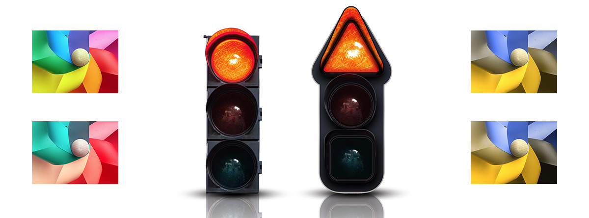
Even as the design community has grown more knowledgeable about human factors engineering, I'm still amazed at how frequently product development teams apply green and red in user interfaces. The traffic light color scheme is a popular metaphor used for desktop window actions and to illustrate scaled levels of severity -- even though these intended meanings don't necessarily translate to the universal cognitive associations of "go", "yield", and "stop".
Color is an important design element, but it should never be used as the sole method of communicating information. Secondary elements such as shape, size, location, and contrast can convey information when colors are imperceptible.
The gaming industry has largely ignored color blind users in the past, but the recent efforts of two video game companies are encouraging. 2K Studios is the developer of the award-winning PC and console game franchise BioShock. Primarily a first-person shooter, both BioShock and its sequel BioShock 2, contain mini games that require users to rearrange colored objects in order to solve puzzles.
2K has issued a patch for BioShock 2 that adds stripes to the red blocks used in one of its puzzles -- an example of texture and contrast as secondary communication channels.
Helsing's Fire is a popular puzzle game for Apple's iOS devices, but players are required to use vibrant red and green-colored potion bottles that have little physical distinction. The game's developer, Ratloop, issued a downloadable update that adds a "color blind adjustment" toggle to the settings. When activated, green bottles become white and there is greater contrast between the red and blue colors.
These subtle changes greatly enhance the game play experience for color blind users and help promote the importance of accessibility in software design.

Touching the Future
Originally posted on April 5, 2010
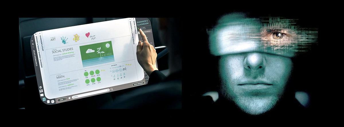
In the 2002 sci-fi thriller Minority Report, one of the more memorable and talked about scenes was of Tom Cruise standing in front of a large transparent “video wall” engaged in a dizzying series of hand gestures. Like an inspired maestro, he manipulates various video feeds the same way an iPhone user might scroll through a miniaturized browser window, or zoom in on a photo.
The film includes a segment in which Cruise’s character is instantly recognized via optical scan as he enters a department store and a video projection immediately makes a somewhat humorous product recommendation based on his profile and purchase history. There are even newspapers that update themselves with the latest headlines.
These technologies are examples of “ubiquitous computing” (also referred to as “ambient intelligence” and “pervasive systems”), and you’ve probably already used the precursors to these futuristic applications in the forms of RSS new feeds, recommender engines, motion sensors, and mobile devices. Microsoft Office Labs is bringing us one step closer with a series of concept videos that forecast how typical day-in-the-life scenarios might play out over the next decade with the help of Office products (sans Clippy).
The videos clearly demonstrate obvious benefits of these new and improved user experiences: reductions in paper usage, “information anywhere” portability, enhanced collaboration, and real-time decision support.
However, there are certain technological, ergonomic, and cultural challenges to overcome before these visions can become reality. Delivery platforms such as malleable display surfaces must be perfected, and the code that runs on them standardized. Evolving direct manipulation interfaces also require extensive usability testing to ensure the devices they run on operate smoothly and comfortably for users of various ages. Perhaps most important are the cultural barriers that can prohibit the adoption of even the most helpful technologies.
In my experience, this has been most evident in health care IT where attempts have been made for years to implement electronic medical records. Physicians are hesitant to embrace new software tools that add even a small amount of time to their clinical workflows, or force them to attend to a computer screen at the expense of patient "face time".
As information technology becomes more pervasive in the home, workplace, and everywhere in between, the need for skilled user experience practitioners will only continue to grow. Precognitive crime-solving and sentient venomous plants? Let's leave that to Spielberg.


